for Kids of Mud, MEC
A new chapter of Kids of Mud (a skills-based mountain biking club) requested a logo denoting energy, passion, and spirit.
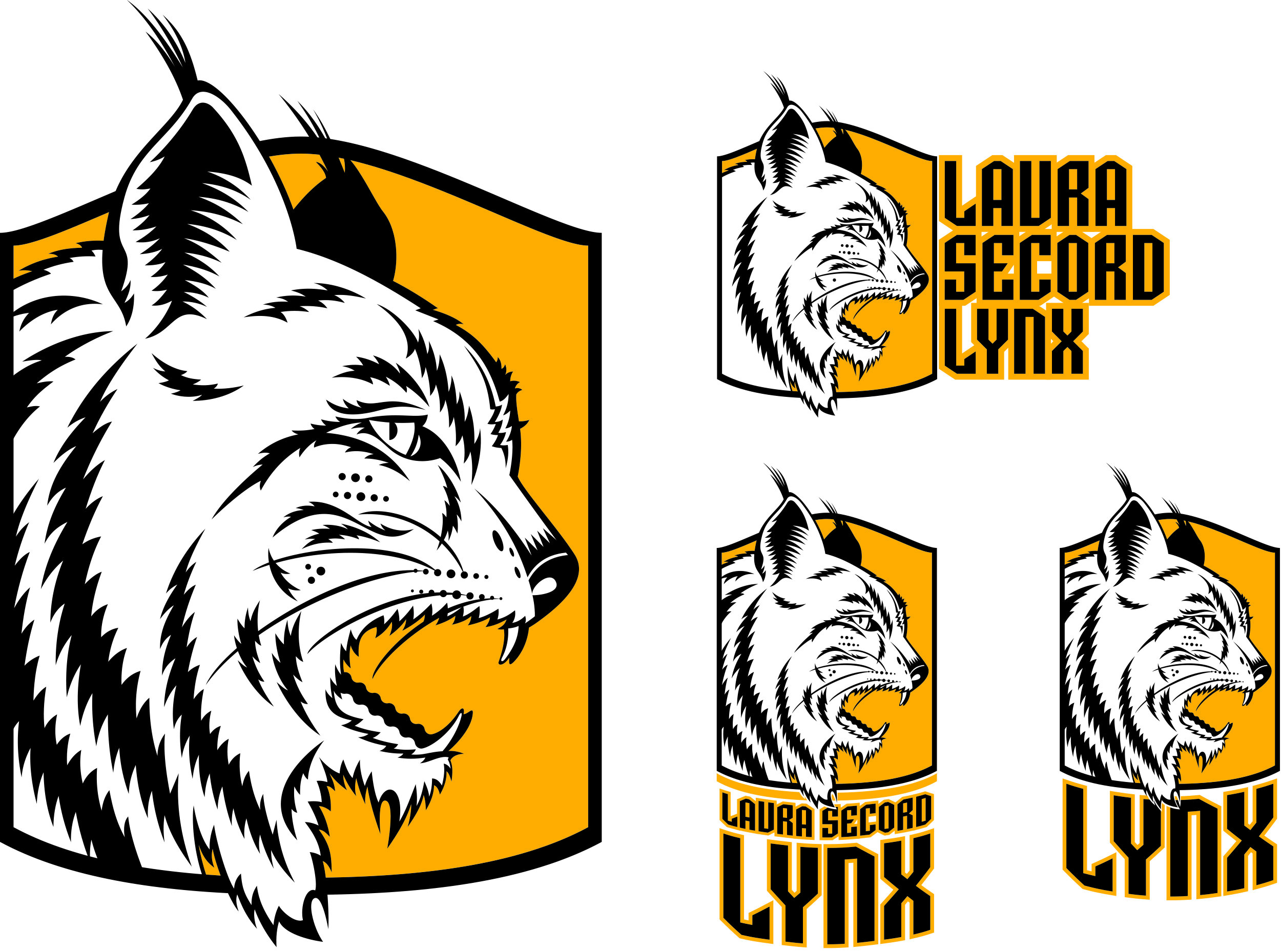
School and sport identity and type options for École Laura Secord School.
with Partners By Design (PxD)
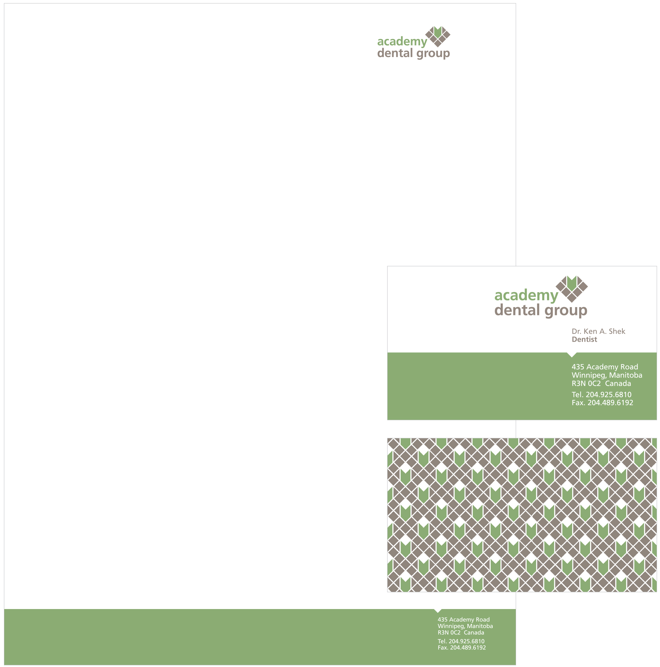
The design intent was for a sophisticated look that corresponded with the advanced services that were going to be offered. The icon referenced the new laser drilling and dental implant techniques that were taking a prominent role in the services Academy Dental Group offered.
Personal
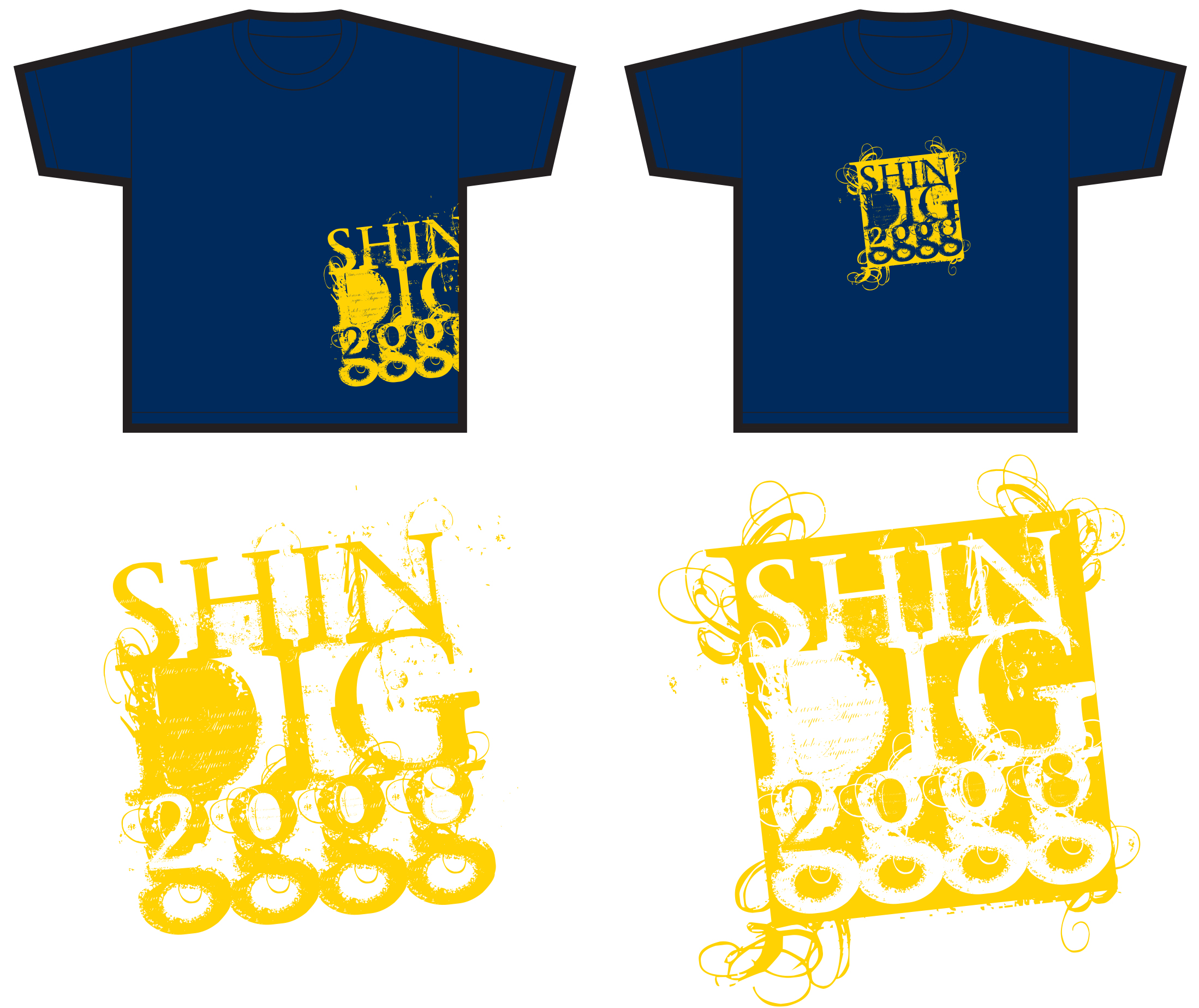
Design for line of t-shirt graphics incorporating aggressive and industrial representations of prehistoric fossils.
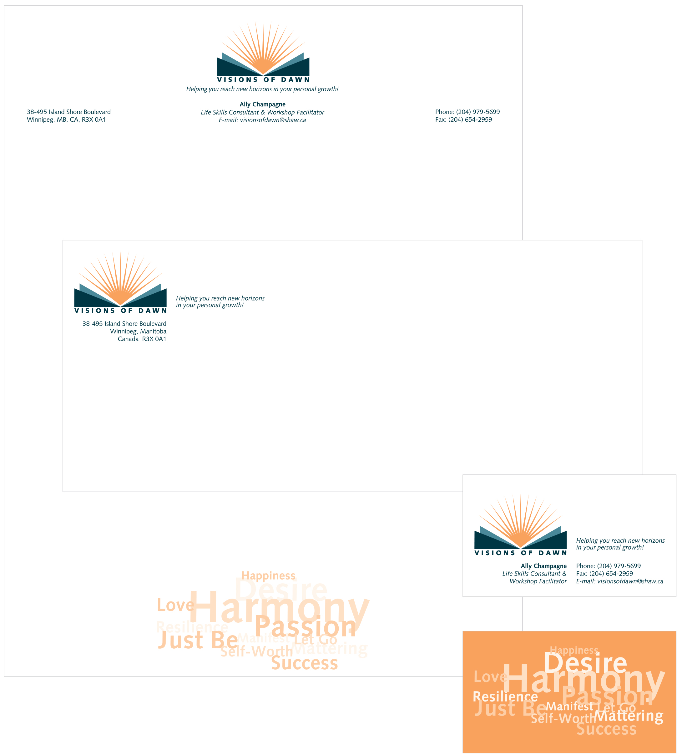
Vision of Dawn offers counseling services when and where a traumatic incident has occurred (e.g. suicide within a school). Councillors emphasize healing through process and that understanding is the pathway to healing.
The foreground of the logo resembles the open pages of a book. The sunlight is the hope of a new day, illuminating the power of knowledge.
for Brokenhead Ventures
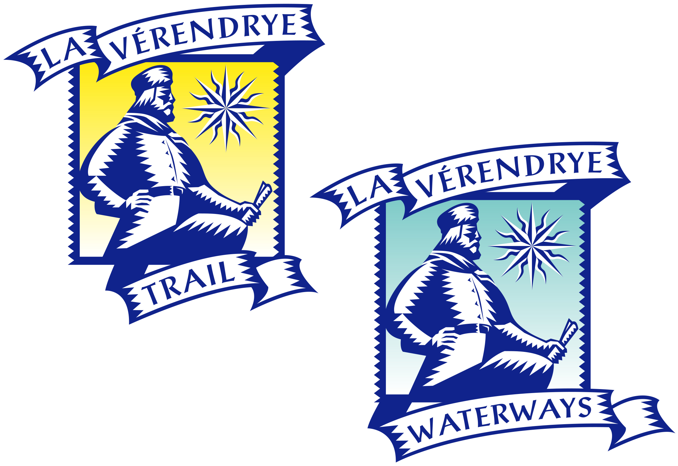
Design an identity/signage system for both highway and water routes commemorating the explorer Pierre Gaultier de Varennes et de La Vérendrye. The working slogan was: Go forth!
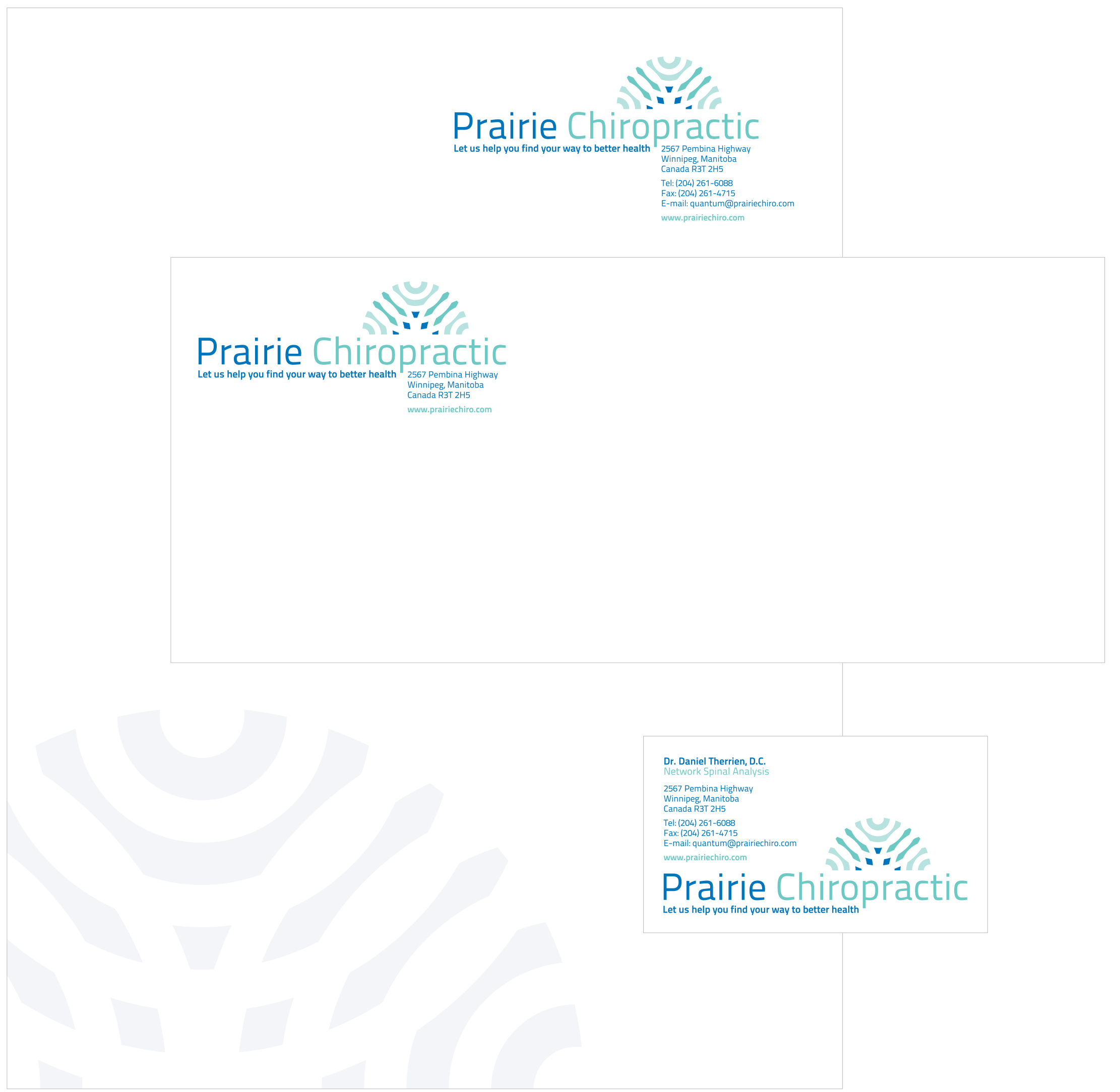
Prairie Chiropractic commissioned a new identity system to coincide with an interior renovation. The clients’ practice focuses on touch so the marque was created by overlapping radiating, concentric circles.
The client (a young make-up designer entering the fashion and film) required an identity to promote and market herself. She wanted a solution that was playful, bright, and energetic.
with Grandesign
The client requested an identity that featured the idea of drinking wine. The marque—a wine glass tipped containing wine about to be sipped—was designed to capture a sense of anticipation and festivity.
for Rivers West
The client requested a logo for the Amazing Tree Quest, a project where people GPS mark a favorite tree for others to search, discover and experience. The twisting line suggest the idea of wandering and searching.

The client is passionate about music and code writing. The company name is a play on the musical term cadenza, where a soloist improvises within a musical passage.
Identity design for a digital literary collective exploring new ways tell and distribute stories and plays. The client wanted to reference the creation story of Turtle Island but with a distinctly digital look
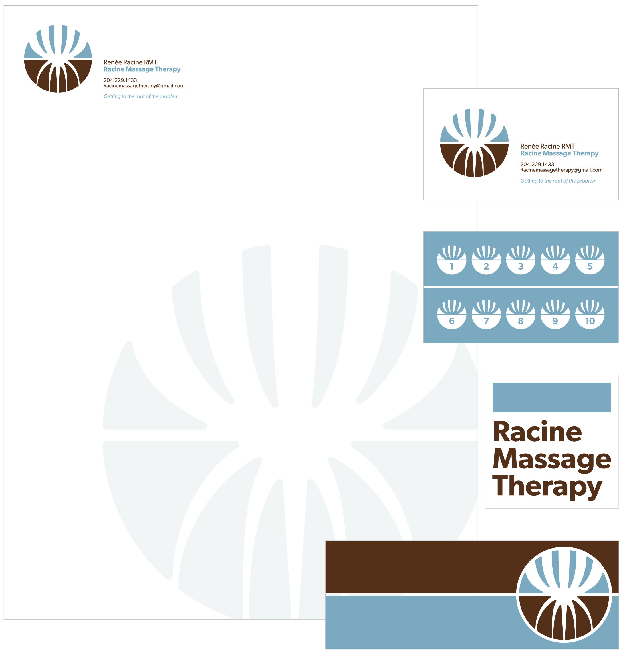
The client wanted to communicate the idea that her clinic was going to get to the root of the problems. She is also from a French background and her last name means “root”.
The design of her office followed a Japanese aesthetic which is reflected in the symmetry of circular marque.
for the Manitoba Whitewater Club
The Manitoba Whitewater Club organizes a white water kayaking and social event every year.
Group members perceive themselves as thrill seekers and risk takers. The design communicates the energy and brashness of the activity and the event. The resulting logo is edgy, grungy and loud.
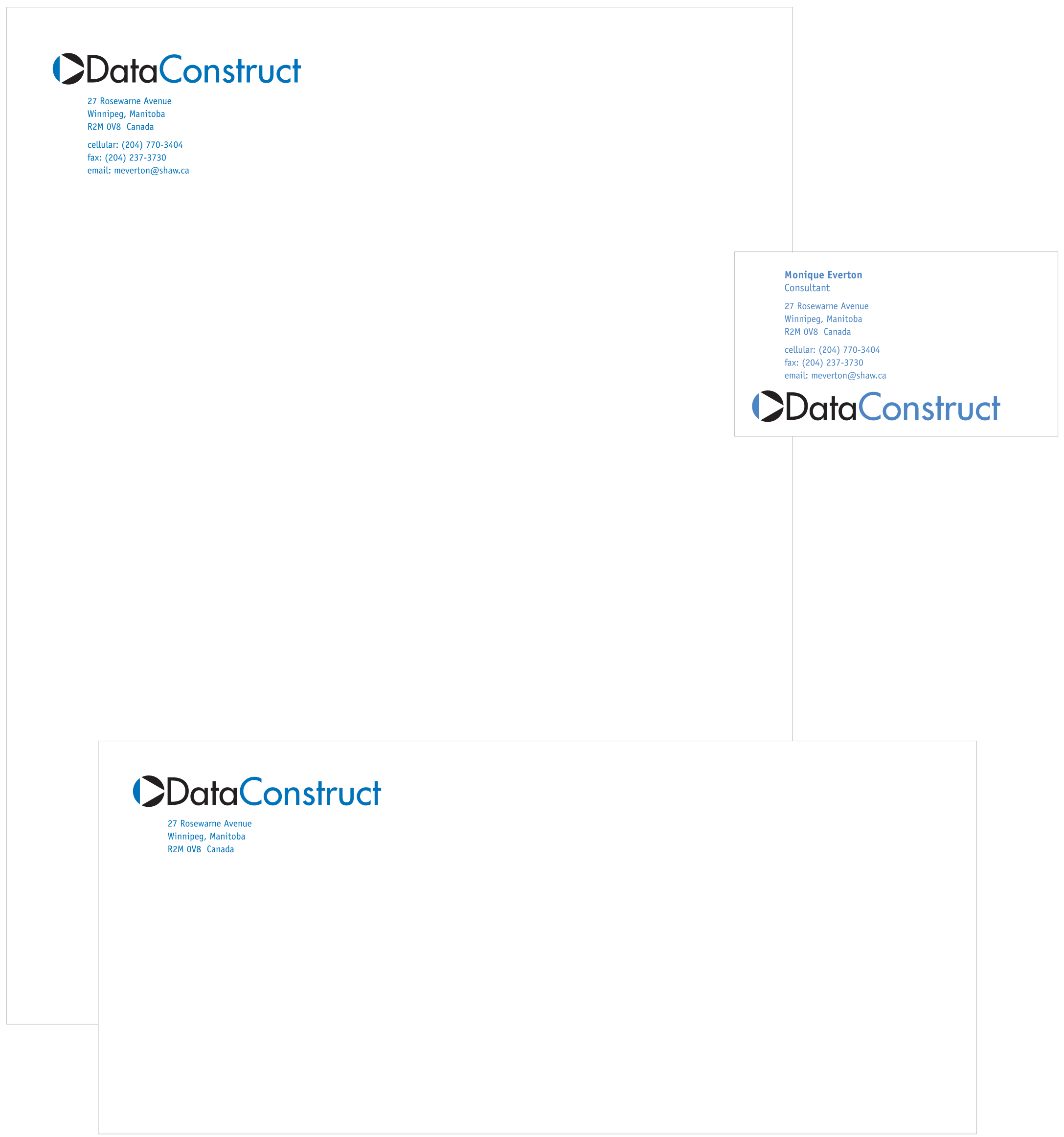
DataConstruct is a small company that provides data management services to a number businesses involved in construction and machinery.
The identity had to be sophisticated to communicate a sense of professionalism but not fussy in keeping with the nature of the clients. The icon references a symbol used in data management to identify a move forward.
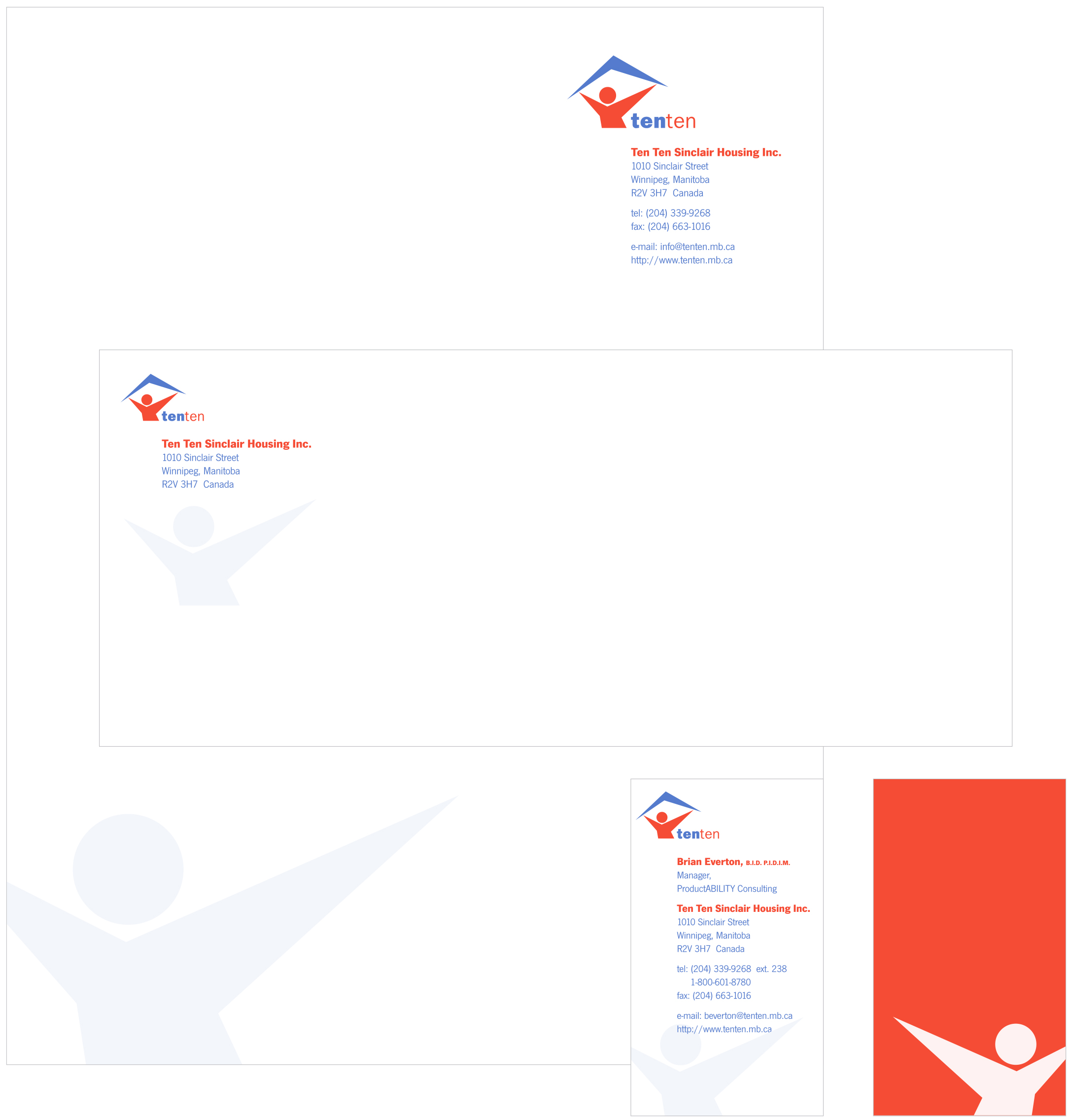
The client was expanding services beyond providing housing for those with physical handicaps to include interior and industrial design and counselling all under one roof.
The client also simplified its name so that it was easier to remember and to be more inclusive.
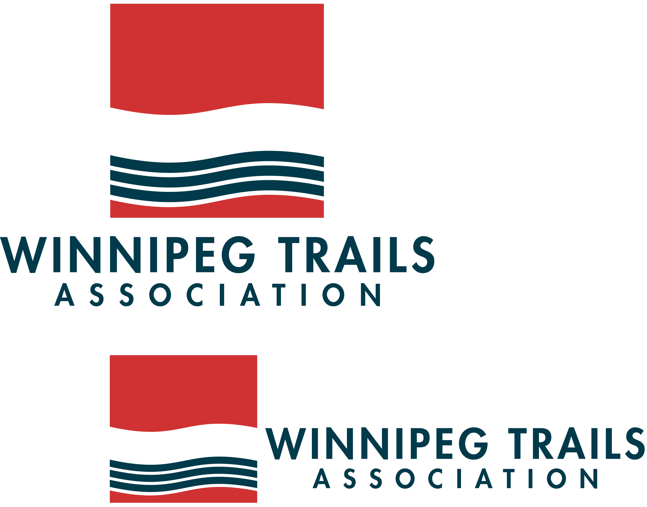
Winnipeg Trails Association requested an identity design that could be used on all future promotional materials (print and web) that stylistically connected to the trail graphics the group initiated.
Many of the trails follow rivers or streams within the city so the identity is made up of a gently curving path paired with a abstracted flowing river.
A retail operation that focused on selling coats required a marque that was clean and stylish. The identity references quick, gestural fashion illustration.
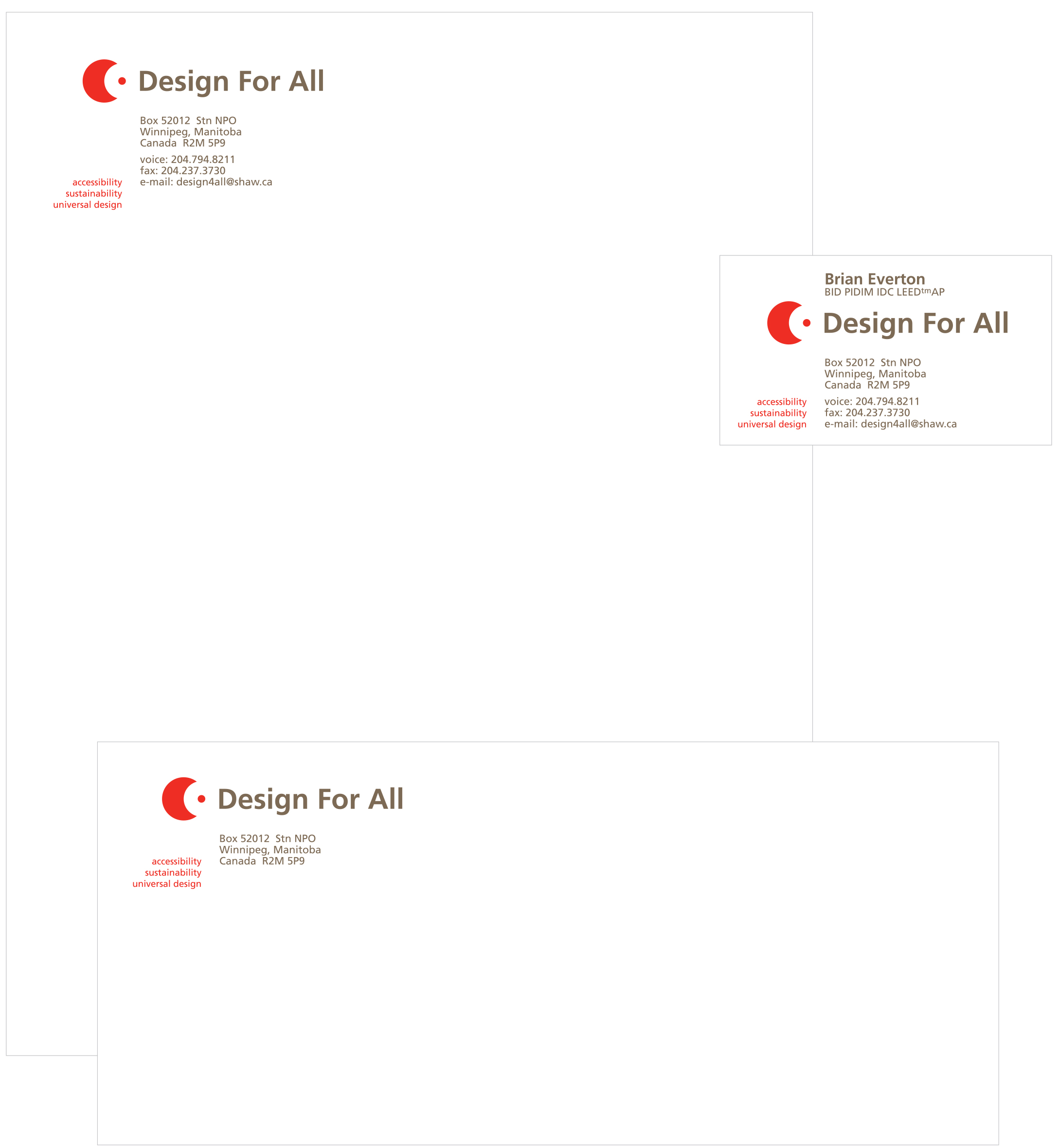
Design For All is a universal design consultancy that promotes, advocates and instructs industry and government.
The design is centred on an icon that incorporates a void but, through the gestalt principle of closure, appears to be a whole form. The goal was to illustrate that everyone, regardless of ability, can be included through good design.
for Interior Design, Faculty of Architecture, University of Manitoba
The Interior Design Department requested an identity based on their accreditation review theme: Evolution.
The dynamism of the department is represented by the use of bright orange. The idea of evolution is described through the progressive arrangement of letter/building blocks (the parts) to construct a larger square (the whole).
for the Manitoba Whitewater Club
The Manitoba Whitewater Club organizes a white water kayaking and social event every year.
The 2009 identity was made up of several overlapping waves while incorporating the pattern of a Maori tribal tattoo which referenced swirling white water currents.
Laurie’s Beads is a small, independent jewelry producer that requested a logo for hang tags, invoicing and point of purchase.
The jewelry is pretty and ornamental. The final design is an elegant, seamlessly constructed monogram. The finished form communicates a sense of sophistication and professionalism.
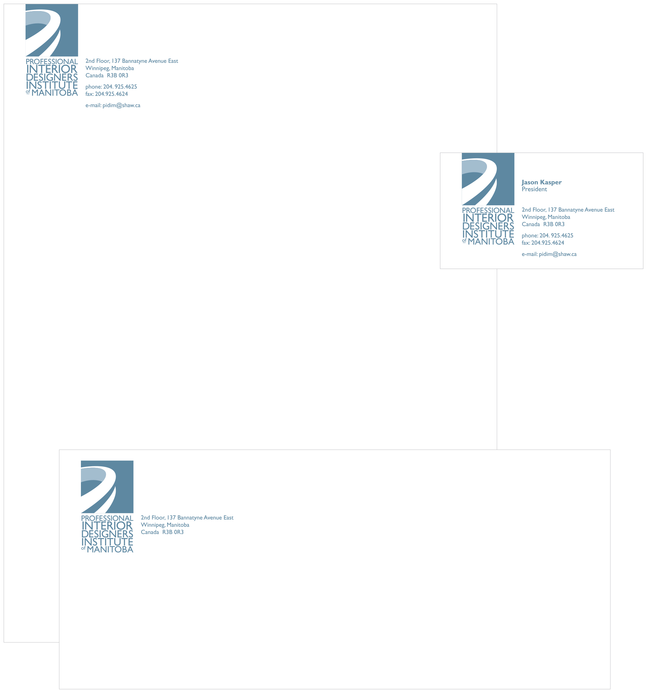
The design of the logo is based on the profile of a ring worn by the members of PIDIM. The shape of the profile corresponds to the ring worn by professional architects in Manitoba.
The type references the Arts and
Crafts movement and the level
of professionalism and craft required of all PIDIM members.
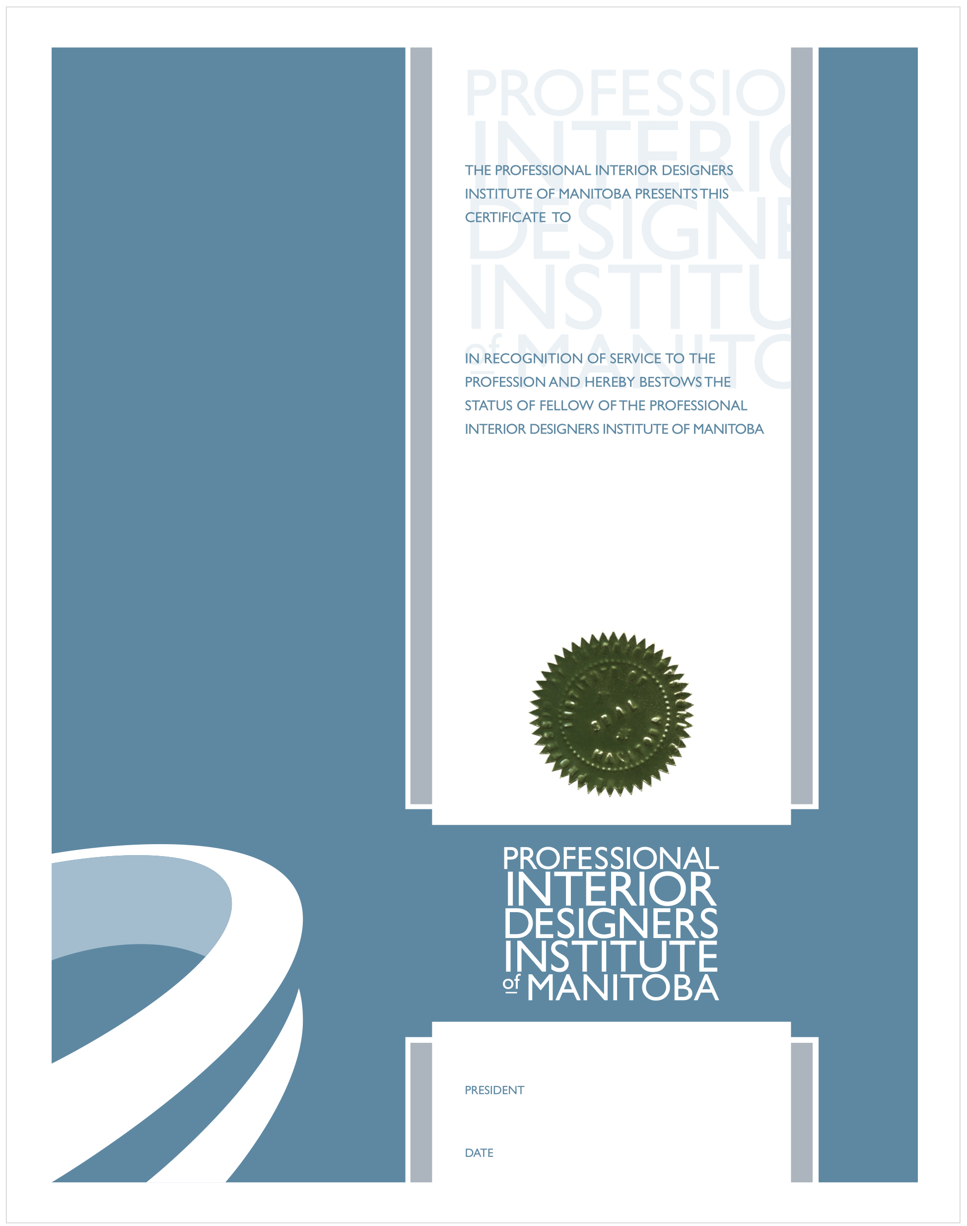
The goal with this project was simple: create a range of certification forms that use the new PIDIM identifier.
The design of the certificates needed to be traditional while referencing the contemporary look of new identity.

with Aquila Samson, Laryssa Sawchuk, Wesley Wilson
We designed new brand and web mockups for a site that supports and encourages diabetics to take advantage of community resources for a healthier life. The designs were produced during a workshop weekend promoted by Hacking Health, a group "designed to improve healthcare by inviting technology creators and healthcare professionals to collaborate on realistic, human-centric solutions to front-line problems".

for the Winnipeg Trails Association
Promotional longboard for the Winnipeg Trails Association. The trail graphics are mashed up and laser etched on maple by Scam Skate.
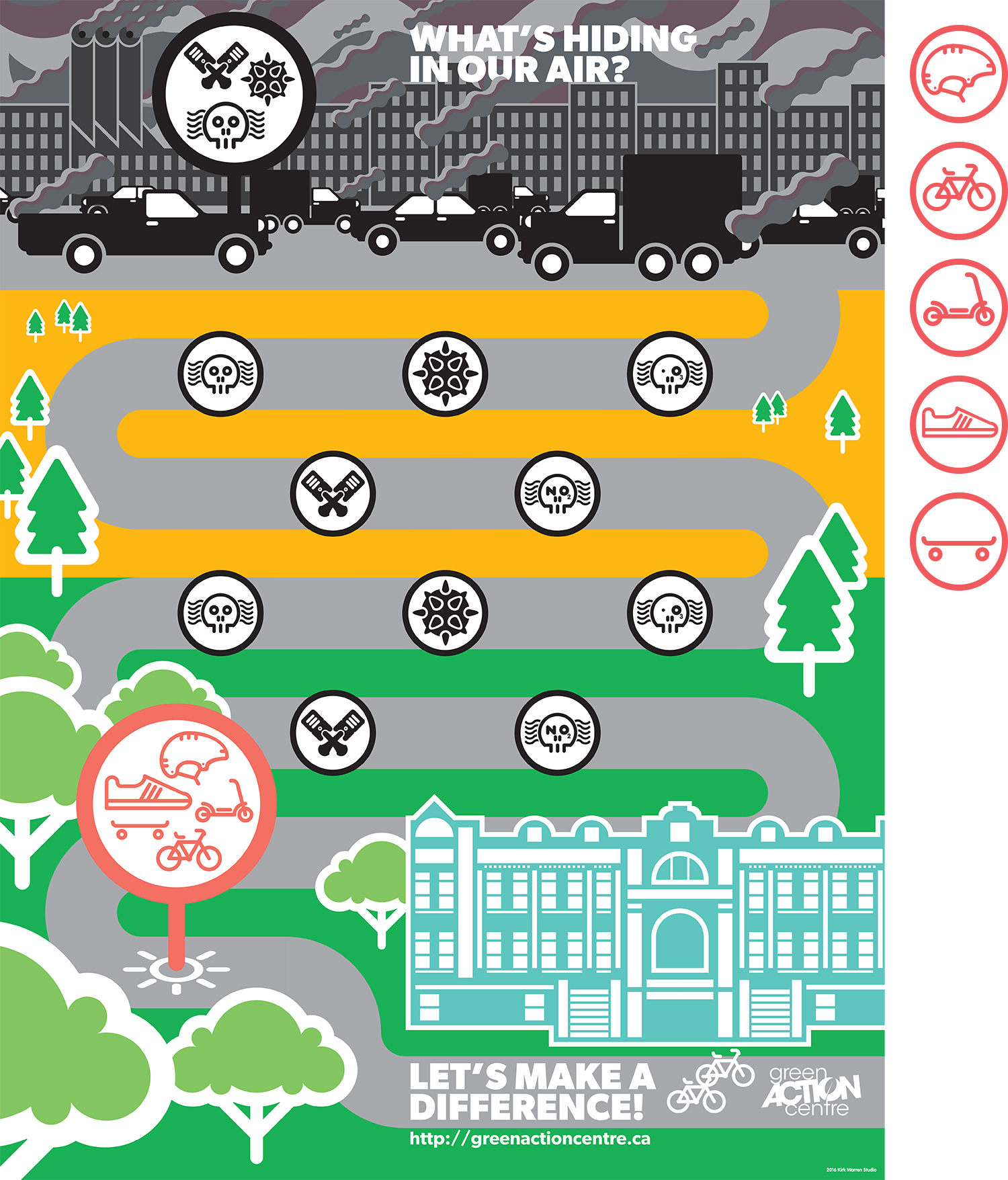
Educational poster to teach kids about the connection between transportation choices and air quality. The poster comes with stickers of good transportation behaviours to place over the bad effects of automotive transportation.

Identity for Arts AccessAbility Network Manitoba, a group that assists artists with varying physical abilities to connect and communicate. The initial letters are abstracted and overlapped to form an an excited vibration, a racing pulse.